

EXPLO
Online student/staff portal to eliminate scheduling issues.

EXPLO is a nonprofit education innovator that brings curiosity, engagement, and humanity to teaching and learning within a selection of summer programs. EXPLO needs a way to simplify the student sign up process for events/excursions and access their real time schedules.
Timeline: Three weeks
Tools: Sketch, InVision, Basecamp, Paper & Pen
Project: Web app design, Team of three
OVERVIEW
My Role
I focused on user research and led the interface design. As lead designer I integrated the team’s designs into a cohesive deliverable.
Research:
Executed feature analysis
Collaborated on user interview questions
Conducted seven user interviews
Took part in affinity diagramming
Identified key themes to define the problem and solution
Design:
Executed lo-fi prototypes
Participated in a design studio
Conducted three usability tests
RESEARCH
Feature Analysis
We conducted feature analyses on three booking apps: OpenTable, Barry’s Bootcamp, and Regal Cinemas. I focused on Barry’s Bootcamp. The most important takeaways were that these sites offered: waitlist options, transparency of available spots, personal profiles to view upcoming reservations/information about customer, and the option to modify booking.


Learning About the User

Our team interviewed seven members of EXPLO’s staff to understand how the student sign up process affects their role. After synthesizing our findings in an affinity map, we found 19 common themes that helped us design a streamlined system.
Personas
Based on the themes we discovered in affinity mapping, we developed two personas to help us plan our design.

Jake
EXPLO Student
Goals and Needs:
Make new friends
Have a fun summer
A quick and easy way to sign up for trips/events
Spend as little time as possible changing trips
Access relevant information about trips and events
Frustrations:
Not being able to get into the trips of his choice
Having to go on trips without his friends

Cindy
EXPLO Staff Member
Goals and Needs:
Be more involved with the community
Give students a great camp experience
Spend less time on data entry
A system that communicates with other EXPLO systems
Ability to keep track of students
Organized way of communicating with students
Frustrations:
Time spent going back and forth between systems
Manually fixing student errors and reorganizing data
Missing time spent with camp students
DESIGN
Sitemap
Through our research, we discovered that middle school students use Chromebooks to access EXPLO’s trips while high schoolers use their smart phones. We decided to tackle the middle schooler experience first and use this as a base for the high school mobile version. The staff site was also modeled on a desktop.
Student Sitemap
Staff Sitemap
User Flows
Three main user flows identified in user interviews.
Student - Join a Trip
Student - Change a Trip
Staff - Add a Trip


Ideation
We began with a design studio to sketch out all pages. I consolidated the best ideas in Sketch which was used as the base file. After conducting usability testing we reiterated the layouts and created a staff portal that modeled the student facing side. We found ourselves reverting back to hand-drawn sketches throughout the process to best explain our ideas.


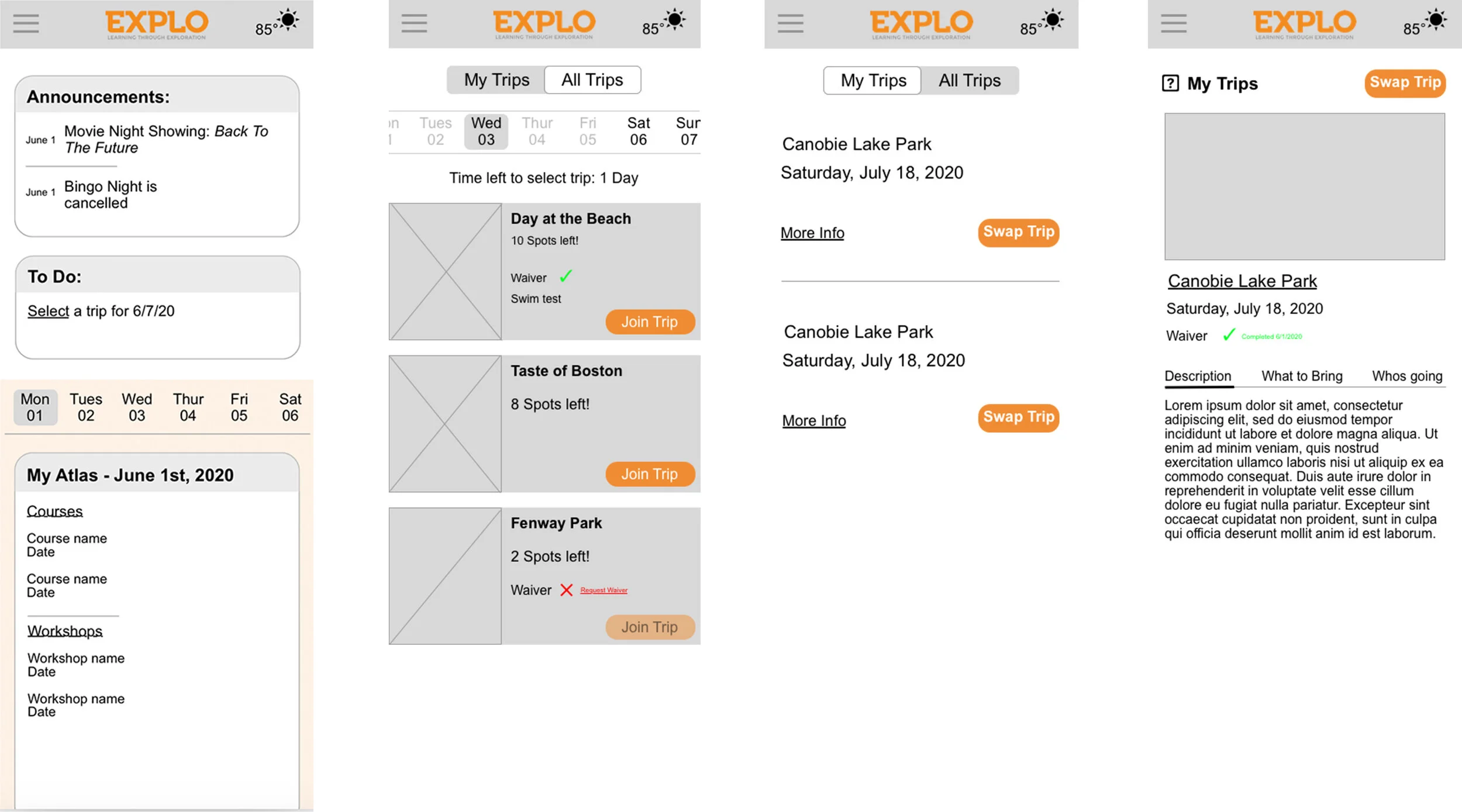
Student Home Page


Changes Made Based on Usability Testing:
Added Announcements as the central spot for what is happening on campus. This will help to avoid confusion about changes in events.
Included a To Do list entice students to sign up for trips/events before missing the deadline.
Created a toggle calendar to avoid confusion about what is happening on specific days and to allow students to see into the next week to better plan their time.
Staff All Trips


Changes Made Based on Usability Testing:
Added calendar to avoid confusion about which day is displayed.
Visibility of system status: trips that are full, published items link will become disabled. When edited it will be clickable again.
Included different actions related to the roster because through testing we found that people did not necessarily want to download the roster.
The Solution
We believe that by creating a student profile feature as a part of a responsive website for students to sign-up for eligible trips/events and access information, students can make more informed decisions and seamless changes. We will know this to be successful when there is a decrease in trip/event assignment changes that require staff intervention.
Prototypes

Mobile
Mobile version for high school students based on the middle school desktop layout.
REFLECTION
What I Learned:
Since the deliverable on this project was a lo-fidelity prototype, we were able to concentrate much of our time on research and testing. This allowed us to focus on the content and functionality without getting caught up in brand guidelines. The many iterations of this product in the lo-fidelity state taught me how crucial it is to do extensive user testing before moving onto visuals.
Next Steps:
Build hi-fidelity prototype for both desktop and mobile
Test prototypes with students